Many of our clients at NC are large, multinational organisations. They commission us to create versions that work across many regions, so translating animation is something we’re very experienced in. Creating the new version a simple question of cutting and pasting. The budget and time required for the work is can be considerable, greater than the client expects.This is particularly the case with a typography animation
See our Animation portfolioTranslating Animation a Typography Animation
SkySight is a great example of the design challenges that can complicate such a brief. The initial animation with English text and voiceover was a short two and a half minute piece, outlining the benefits of a new software solution from Capgemini, a global digital consultancy.
We received the script, a deadline of four days and the above image outlining the product’s logo and branding.
Given the timescale the solution we arrived was a text based piece, using the basic curved lines of the logo to gently and stylishly emphasise the script.
The steps involved
The client emailed us very happy with the outcome, requesting a French version be produced for later that day. We explained that as it was heavily based on the transition between specific text elements, this was a big challenges. We could turn around all the changes in under a day without losing much of the style. So we explained to the client where some of the challenges were.
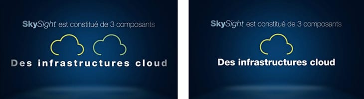
At this point, the clouds are drawn on side-by-side and the English words ‘cloud’ and ‘environment’ appear below. They slide together to create the title.
![]()
In the French version the phrase ‘Des infratructures cloud’ is considerably longer and is three words not two. This meant employing the same placement and movement would not work. Without reducing the size of the text, we instead spaced out the letters, contracting them as the clouds moved in to the centre.
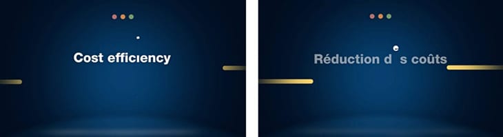
In the next section, the five titles mentioned create a dot which produces the final logo at the end. In the English version the dot from this title rises from the ‘I’ in the word efficiency. As the French phrase changes to ‘Reduction des couts’, we used the ‘e’ in ‘des’ to transform into the dot.
Not a major re-working, but both examples show how each frame is reassessed and the design process reapplied. The clear look and feel we developed for the English version made it easier when implementing the translation. However, we when are translating animation, we ensure that all the creativity you’ve put into the first language is equally taken in any others!